More Colorful (But Small) Pots

I’m still having a problem dealing with fine lines and disappearing colors. Even when I score the linesĀ  and then paint the underglaze into the grooves, the color tends to leak out during glazing (see the fuzzy black lines on both of these pots). And the color “rose” is frustrating me. It has a tendency to completely disappear, as it did on the left side of the blue squiggles on the righthand pot. Rose may have to go the way of the “eggshell” glaze for me–at least until I know more about what I’m doing. I wonder if I have to wait until the clay is drier to do my painting. That will be the next experiment, once I get back into the studio, that is. It’s closed until January 6.

60’s Throwback

This is the largest pot I’ve thrown so far–about 7 or 8 inches high. Took me several tries, but I was determined to get at least one successful larger piece that day. It’s actually quite balanced and does not have my signature heaviness at the bottom. My son tells me it looks “very 60s.” I’ve been experimenting with how many coats of underglaze I need to apply to produce solid, opaque color on white clay when fired with clear glaze.

But can I do it again? Time will tell!

Oops!

DSCN4895

I was surprised when I got this plate back from glazing. I used mandy white on one side and randy’s red on the other, with some granny’s black shorts added for effect. The overwhelming effect seemed to be the mustardy brown that showed up where the red should have been. It took me a while to figure out that I had goofed by dipping the entire plate into the white glaze and then half of it into the red, forgetting that it would be way too much glaze on the piece, and thus producing the muddy effect. I should have dipped half and half with a small overlap. Won’t forget that one again.

Success!

The aesthetics of art is in the eye of the beholder. Maybe you won’t like these two bowls, but I like them! Not only do they look like bowls (i.e., roundĀ shape), but the underglazes didn’t wander off on me. The colors stayed put and did what I expected them to do. This is white clay. See the difference? No yellow cast. No speckles. I like it.

Another Botched Sgraffito Pot

DSCN4888

This pot came out really well, don’t you think? It’s one of my tallest to date, too–about 7 inches high. And it looked terrific after bisqueing. I was really excited to see it glazed and fired. And here’s how it came out. All my hard work for naught. I used a too light underglaze color (purple) on a clay that produces obliterating speckles. Lesson learned? Stay away from sgraffito until having time to research how to do it properly.

Back to the drawing board. I need to create another of these pots if I can. Isn’t it cool? I feel like I need a genie.

Practicing Sgraffito Without Knowing What I’m Doing

DSCN4882

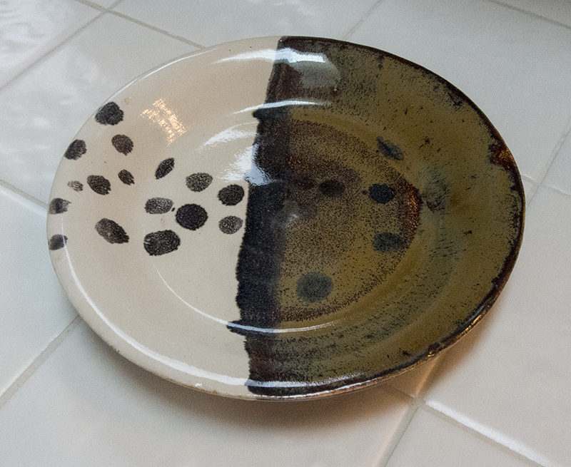
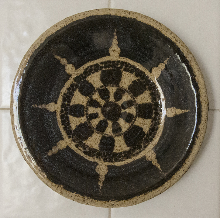
So I learned about the sgraffito technique for decorating ceramics from my Ojai teacher. Using this technique, you paint on several coats of underglaze, then scrape off part of it to make a design. I did a couple of pots like this while in Ojai, but do not know how they turned out, or even if they turned out. My friend’s property did not burn, but I guess you saw the Thomas fire that ringed Ojai on the news. They’ve been a bit busy out there. So distressing.

I have one more Reston sgraffito pot (not photographed yet) that had a similar turnout in that the clay surface was too rough to get good sharp lines and details. Both pots looked much better at the bisque stage. Once this plate was fired with clear glaze, the design wandered off a bit and I lost the details. I should try this technique using white clay, which seems smoother. Or maybe I should sand my pots after bisqueing. Every pot is an experiment!

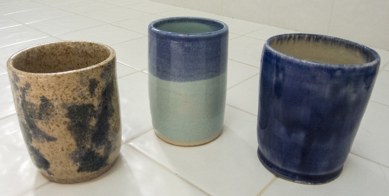
The other surprise to me was the resulting color of the underglaze paint after glaze firing. It was a bright green when initially applied. The glazed green looks black with blue flecks (hard to see here). The gray clay fires to this brown color with darker brown speckles, having to do with the chemical reaction that occurs when the clay is fired at a high temperature. I can’t claim to understand the topic well enough to discuss it further. I just know that I’m having a hard time keeping color with this gray clay.

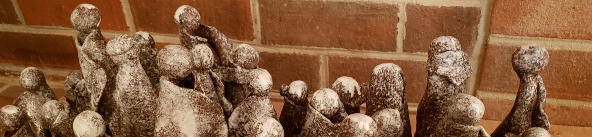
The upside of all this is that it’s exciting to get finished work back because I never know what it’s going to end up looking like. From what I gather listening toĀ  other potters at the studio, including the advanced ones, everyone is in the same boat.

A Growing Number of Small Drinking Cups

DSCN4878

To master the art of centering a ball of clay on a moving wheel, placing a hole in the center–exactly in the center–and raising the walls to produce a cylinder that does not fall apart, does not lean like the Tower of Pisa, and does not weigh as much as a brick is not any easy thing. So, I throw cylinder after cylinder after cylinder. Sometimes I get a bowl when one gets away from me, but that is getting to be less and less. I’ll work on intentional bowls later. So here are a few functional…well maybe not so functional…water cups. My husband tells me that these are too small to fit his nose inside. No comment. So let me know if you have a small nose. I have a cup for you.

A Series of Small “Tulip” Vases

I dreamed about this. When I woke up, I became obsessed with making these tulip vases. You already saw the one on the right. It was the first. The second was the one on the left. I used several underglaze colors to “watercolor” the petals. You can’t see it here, but there are two shades of green and some yellow also involved in addition to the red. I also opened the flower a bit at the top. The third-try middle pot is more stylized in that I used flat areas of color in each of the tulip petals. It was supposed to be dark pink and light pink, but the light pink completely disappeared, leaving only a subtle rose on three of the petals. The disappearance of the color is due, so I was told by a more experienced potter, to failure to paint the colored glaze on three to five times, waiting for each layer to dry completely before applying the next layer. Some of my unexpected effects could also be due to the type of clay I was using–gray, not white. The gray clay we use fires to a brownish color with speckles. White might be better. But I’m not done with this yet. I have one more of these tulip pots drying in the wings (larger than these), waiting for further innovation and experimentation.

January 28, 2018
I added the last white tulip pot (the white one)–roughly the same size as the others (after all), but half the weight. But I still lost the rose and pink colors, even though I painted them on multiple times. You can see the rose color at the top of the petals ever so slightly. I think I’m done with these. I saw someone else making a large one last week. I’ll have to see how hers turns out.

A Carnival of Finished Ojai Pots

You’ll have to figure out relative sizes of the pots by using the square white bathroom tiles they are sitting on as a guide. Hint: each tile is 4 inches square. There are really only two diminutive pots here. I was starting to throw larger by the end of the Ojai week. The largest are the texturized green planter at the top left and the green bowl that is the fourth down on the left.

My underglazes went south for the most part. I threw some designs on the pots the last day I was at the studio without really understanding the exact process that would take place for glazing after I left.

I am, however, quite pleased with the balance of the pots. None of them weighs a ton and the walls are pretty even. I did indeed learn something from my adventure.