Still At It

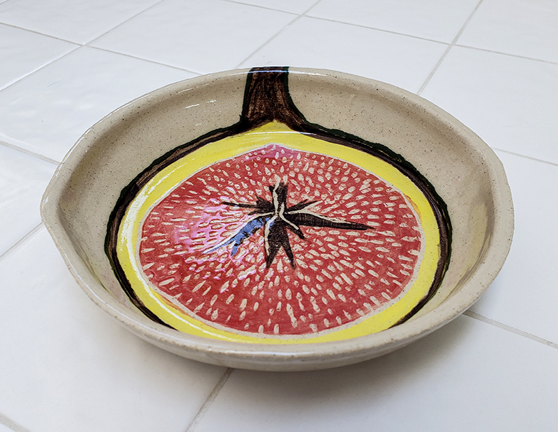
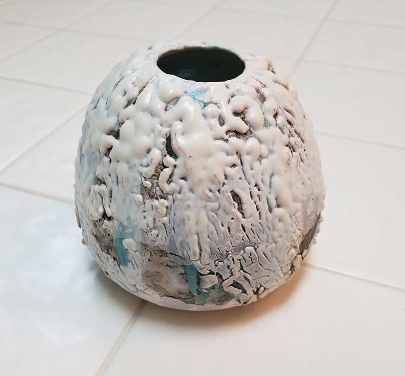
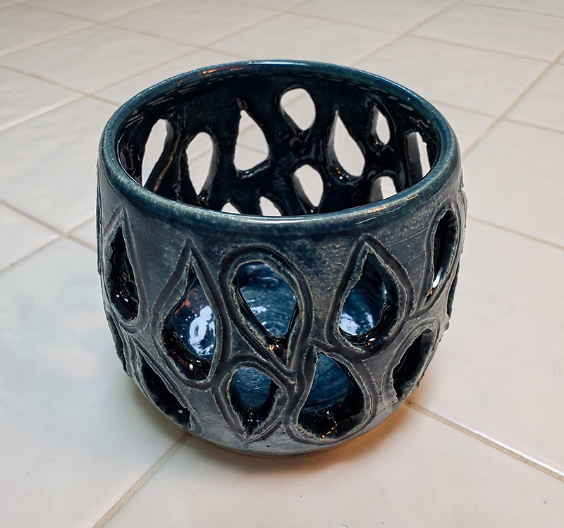
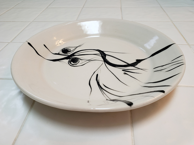
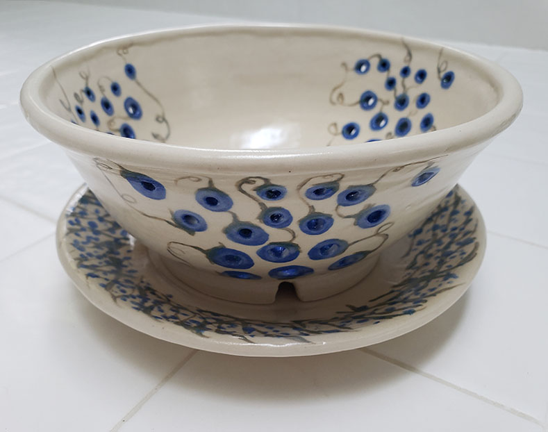
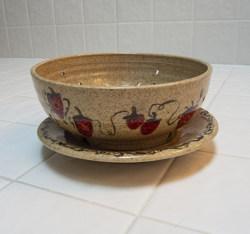
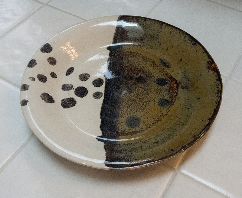
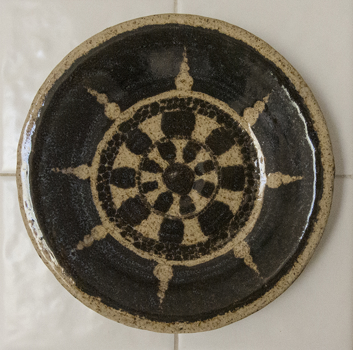
I haven’t posted much here lately because I’ve been too busy making. And preparing for my Masters show in November. Here is a sneak peek at some of my pieces. In addition to functional pieces, I’m also working on a possible sculptural narrative. I feel like I still have a long way to go, but that said, I’m heading for a two-week workshop in ceramic sculptural form at the Haystack School of Craft in Maine. Perhaps I’ll come back with new inspiration.

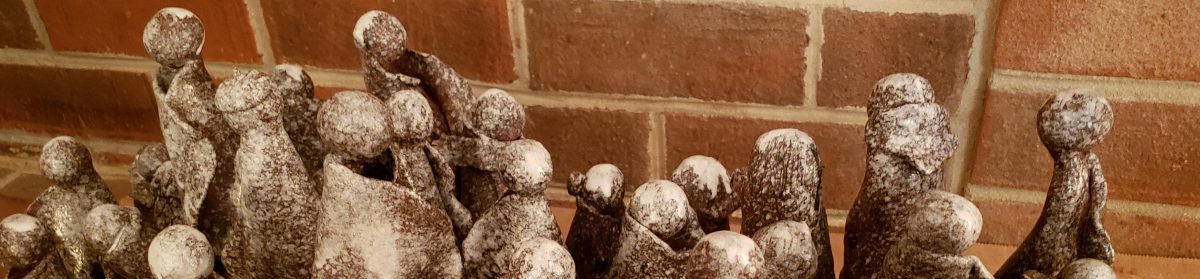
I used paper clay to create the impressionistic people in the sculpture pictured. So great working with paper clay. It’s pliable and light. When it survives through the bone dry and bisque stages without clumsy mishandling (and breakage) to the finished glaze product, it’s as strong as any other vitrified glazed piece.

Lemon Tree

Here is another member of my recent explosion of lemon-themed functional majolica ware. This piece has found a new home by way of last weekend’s pottery sale. This plate at 10 inches just fit into my tiny test kiln, which I am still relying on. I should have a full-sized kiln by the end of the month! And then maybe I can learn how to make larger work!

Tis the Season for…Berry Bowls!

I’ve been making–and selling!–a lot of berry bowls during this warm and summery time. One berry bowl is essential for every kitchen. A second berry bowls is not out of the question. In case you don’t know what a berry bowl is, it’s essentially a colander for washing fruit that can then be stored in the frig (or kitchen counter) for easy (and clean) pickings when you get hungry.

The surface decoration on these bowls is sometimes just glaze on bisque, but increasingly it’s underglaze before bisque.

A Few Old, One New

FigPlate_20200725_153036CrawlVase_20200722_094734Illuminary_20200722_094909Swoosh_Plate_20200722_094700

The community studio where I often hang out opened back up on a very limited basis a few weeks ago. I’m doing fine working on ceramics at home, but I did pop in to rescue my marooned clay (getting hard) and a couple of pieces that had been bisqued.

The porcelain plate with the swooshes and the…eyes?…is finished with a commercial Amaco clear glossy glaze. I bought some so that I could stop depending on my not-quite-there-yet clear glazes that I’ve been working to develop. The blue luminary sports Amaco’s Storm celadon glaze.

I made the small vase a good while ago, but had never taken it past bisque. It was sitting there waiting for a test glaze. I found just the thing. This won’t be to everyone’s taste–only if you enjoy abstract, experimental art I would say. I had a clear glaze I was working on go wonky and crawly on me, but I was intrigued enough to want to do something with it. I painted on a few swaths of different underglaze blues and rebisqued the vase before painting on the wonky glaze. It did just what I thought it would do. You can see the blue underglaze coming through where the clear glaze shivered and crawled off the surface. I had to take a dremel tool to smooth out the rough, pointy spots. I find it textural and interesting.

The fig plate is new. This started out trying to be a plate thrown with 8 lbs. of clay. Yeah, sure. Not there yet. I was also using some white stoneware I had never tried before. It’s much darker and “dirtier” than I expected, so not really a great candidate for underglaze painting. I think I’ll earmark the rest of that batch for glaze only pieces.


Glaze Application Class

More school work. This is from my recent glaze application class. We were taught an interesting batch of techniques, but I was not familiar with these particular glazes yet. Here’s how it broke down in the end.

I applied a dark glaze first, then a teal overlay to the pot on the top left. Applying the white base, then a navy design on the top middle plate and bowl worked better.

Layering teal over randi’s red on the tall vase on the top right was somewhat anticlimactic, but then randi’s red rarely cooperates. Do you see any red? These pots were fired at cone 6, which is almost always too cool for randi’s red. I don’t know why it’s included in glaze offerings for electric kilns fired at cone 6. Not even the inside came out red in this case.

The square plate in the middle got some sort of speckled blue glaze over white on a scratched in design. Meh.

The garlic pot in the middle (the one with the holes in it) is hakamed fern over white-breaking brown. Most of the fern glazed was dissipated.

The deep bowl is tenmoku brown over fern. It came out well.

My favorite is the bowl on the bottom. Believe it or not, I sprayed it with navy blue, then flung some opaque white onto it. Unbeknownst to me, the navy needs a heavy coat to actually show as blue. I didn’t spray enough and got green, but if you look closely, you can see the blue specs. The white design looks like spilled milk. I like it.

Now I need to practice and experiment more with these glazes. Already doing so.

A Strawberry-Themed Berry Bowl

I made this colander bowl and separate plate while at Shady Nook (Thousand Islands) in August and decorated and glazed them in the community studio at home. They have been in the community center display case ever since and have just been liberated. They are now in my refrigerator, the bowl filled with blueberries. Looking forward to strawberry season.

DSCN5818

Another Cat Bowl, Another Cat Cup, as Well as Other Assorted Small Stuff

Here is an assorted hodgepodge of stuff. The yellow lemon is a pinch pot I was showing someone how to make that eventually turned into a small bowl for squeezing lemon juice into for pouring while cooking. The cat coffee mug speaks for itself. I had some trouble keeping the black and brown lines from bleeding, but the cup and handle turned out well. Can’t have everything.

The fish plate and the blue plate are the results of my first foray into porcelain. Oh my! I have to learn how to throw this clay. I threw several other pieces that fell apart. It’s a very smooth clay that has very little if any grog in it (bits of dried clay) that give it “tooth,” or something to hold onto. Because I got used to using a lot of water with other clays I’ve been using, the porcelain got saturated quickly and flopped while I was trying to work with it. I need to figure out how to manipulate it using much less water. Once bisqued and glazed though, porcelain is lovely and hard. It’s a joy to draw on, and the lines hold their shapes with little or no bleeding.

Mostly I’ve been working with clays that will fire to a high temperature (cone 10) for a salt glazing workshop I will be participating in in April: Phoenix and Loafer’s Glory. Those of us participating in the workshop will show up with roughly 10-15 pieces each (20 if you throw small like I do) to glaze and load into a special brick kiln. So, I have lots of pots in process that will show up in a batch near the end of April or beginning of May! Stay tuned!

In the meantime, also stay tuned for (hopefully) more successful porcelain pieces.

Oops!

DSCN4895

I was surprised when I got this plate back from glazing. I used mandy white on one side and randy’s red on the other, with some granny’s black shorts added for effect. The overwhelming effect seemed to be the mustardy brown that showed up where the red should have been. It took me a while to figure out that I had goofed by dipping the entire plate into the white glaze and then half of it into the red, forgetting that it would be way too much glaze on the piece, and thus producing the muddy effect. I should have dipped half and half with a small overlap. Won’t forget that one again.

Practicing Sgraffito Without Knowing What I’m Doing

DSCN4882

So I learned about the sgraffito technique for decorating ceramics from my Ojai teacher. Using this technique, you paint on several coats of underglaze, then scrape off part of it to make a design. I did a couple of pots like this while in Ojai, but do not know how they turned out, or even if they turned out. My friend’s property did not burn, but I guess you saw the Thomas fire that ringed Ojai on the news. They’ve been a bit busy out there. So distressing.

I have one more Reston sgraffito pot (not photographed yet) that had a similar turnout in that the clay surface was too rough to get good sharp lines and details. Both pots looked much better at the bisque stage. Once this plate was fired with clear glaze, the design wandered off a bit and I lost the details. I should try this technique using white clay, which seems smoother. Or maybe I should sand my pots after bisqueing. Every pot is an experiment!

The other surprise to me was the resulting color of the underglaze paint after glaze firing. It was a bright green when initially applied. The glazed green looks black with blue flecks (hard to see here). The gray clay fires to this brown color with darker brown speckles, having to do with the chemical reaction that occurs when the clay is fired at a high temperature. I can’t claim to understand the topic well enough to discuss it further. I just know that I’m having a hard time keeping color with this gray clay.

The upside of all this is that it’s exciting to get finished work back because I never know what it’s going to end up looking like. From what I gather listening to  other potters at the studio, including the advanced ones, everyone is in the same boat.