First Deliverables of the Year

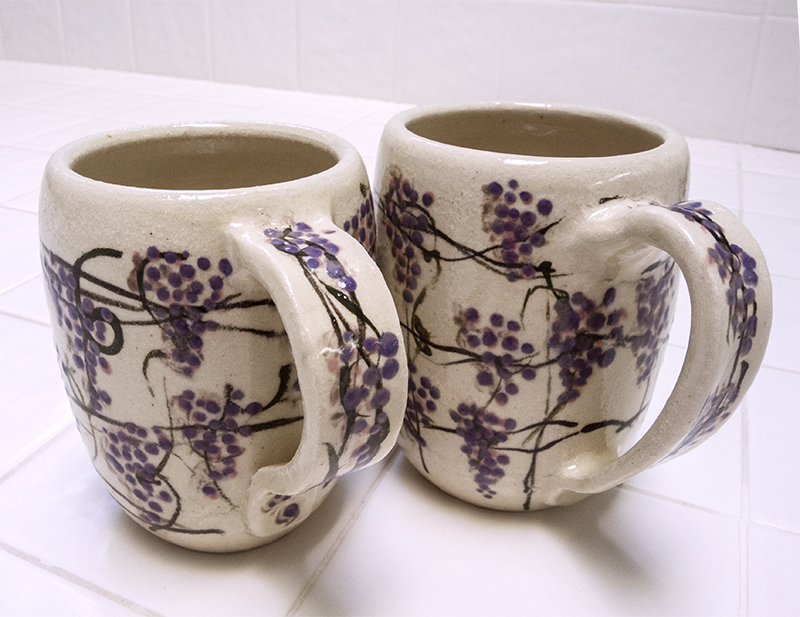
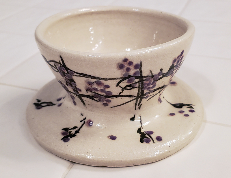
Somewhere along the line, I acquired a repeat customer who loves my “Mediterranean ware.” These pasta bowls and French coffee mugs will move to their new home later this week. The four bowls will be added to four other bowls I made…probably in 2022, to make a set of eight. The French coffee mugs are also going to make a set, but one is to replace a mug that got broken and the others are to join the original remaining mug to make a set of four.

This was a challenging task for me because all I had to go on visually was a printout of the photo I snapped of the first bowls and mugs and my memory. The clay is most assuredly different from the original stonewareI used and the new stoneware appears to have had a higher shrinkage rate. The four new bowls will most likely be a bit smaller than the original bowls. Same for the mugs.

The “yellow” color that appears on both the bowls and the mugs was one I originally created by mixing together white, various yellows, and a bit of red and/or orange underglazes. It’s impossible to determine the actual color outcome until the pieces are glaze fired. The newer pieces are much warmer (i.e., orangey) than the original pieces. I think the color is lush and beautiful, but I sure hope they are not so far removed from the originals as to jangle the perception of a set! Such is the unpredictability of making ceramics. I hate it, I love it!

Duality

I’ve reached an important milestone: my Masters show after over three years of hard work. Now I get to put what I learned from earning this degree into practice. It’s fun getting up in the morning!

And I finally created a rudimentary website as a springboard of what’s to come. Please visit!

http://ceramiclectia.com/

A Work in Progress

The shorter pots in front are meant to be a coffee set–coffee pot, filter that fits on top of the coffee pot, sugar bowl, creamers, four cups. In back are a kitchen utensil holder and a spaghetti jar (which is meant to receive a cork on top). I’m also working on a sculptural component for this project.

The Majolica white glaze is stable now (new batch) and I’m working through ideas for my masters program show later this year. I still have a long way to go in thinking all of this through. For one thing, I’m still working out the best way to render the drawings. Stay tuned.

Test Glazes on Bowls

My focus this year has been to create and test glazes I can use on my ceramics moving forward. It’s time-consuming and challenging, but oh so rewarding when they work and look good.

I made these little bowls for a class last year and they have proven to be great test pots for my glazes. The clay is what I call “garbage” clay–most likely reclaimed stuff we were given to work with in class. It’s not what I’d call great quality (including body color), but they do for initial glaze testing. I start with glaze formulated for cone 6 (mid-range, oxidation firing) on small non-good-quality porcelain test tiles. Once I get a test tile result I’m happy with, I move on to a test pot.

Here are a few of my first successful tests. On the top left bowl has a color I named “Turquoise Stone”; the inside is “Campania Clear, Semi-Matte.”  The top left showcases “Petal Pink”; the inside is “Kitten Clear, Revised.” The left middle bowl shows off “Maroon Pink”; the inside is “VC Transparent Clear, Revised.” The middle right bowl sports “Gray Pink”;  the inside is “Clear #1.” And the bottom bowl features my tenmoku-like “Coffee”; the inside is “Clear #2.” If I decide I want to move on with these glazes, I’ll eventually need to have them tested for food safety, although the chemistry of each indicates that they are. I’ll also need to test on a variety of different clays.

Grapevine Coffee Set


DSCN618820191023_213450_800

Still fussing with coffee mugs and pourovers (and handles!), as well as pummeling underglazes to bend to my will. This time I used white clay–always a better bet for painting on designs than darker clay. The last time I tried this particular design (see Tea Party), I had used a darker clay that had a lot of manganese in it and a purple underglaze color I had mixed using red and blue to equal purple. The fired purple turned blue and blurred. I wasn’t happy.

For this set, I used purple underglaze for the grapes, then subsequently talked with a rep from the company that makes the underglaze at a recent clay conference I attended. Fortunately, I had not yet bisqued any of these. After that conversation I clearly saw that I would not get the results I was expecting. The rep indicated that the purple would turn blue because it was developed for cone 5 (a cooler temperature than the cone 6 we normally fire to at our community studio). I didn’t want blue; I wanted purple. I asked if the color, amethyst would work as a purple at cone 6 and got an affirmative answer. So I collected my pots and proceeded to paint on amethyst grapes over the top of the purple ones.

So here’s what happened. The purple didn’t turn blue at all. It faded to pink. The purple that I mixed with a bit of black for some shading ditched the purple, coming through as smudges of gray. The amethyst saved the day! I got purple grapes. All in all, I’m very happy with the results. Now how often do I say that??

Another Couple of Coffee Pour-overs

Here is a fun pour-over I made for someone who admired the last one and wanted one for herself. She likes cats a lot! It’s large enough to fit over a small pot and can make two cups of coffee at a time.

There was supposed to be some green grass in there somewhere, but the green underglaze burned off. I used red clay as the slip and underglaze on the medium brown clay. At least that stayed put.

DSCN6008

And this pour-over is a smaller one for use with a cup. It also has a final destination.

I used white glaze over brown clay with variegated slate blue as the accent.

Coffee Pourover

DSCN5971

The person sitting at the wheel next to me at the Wednesday open studio sessions for a while inspired me to try my hand at making one of these coffee pourovers she was turning out at the rate of one per week. She was experimenting with functionality more than anything. I cashed in on her most successful design (there having been many flops apparently) and made this rather successful model.

So. A note about functionality. You can’t see the bottom, but there are two “feet,” one at the outer edge and one much closer to the center. This, presumably, is to prevent the liquid from leaking over the edge of the cup over which the pourover is placed. The squishy oval of the top is to accommodate the elongated cone-shaped paper filters.

More importantly, I had to learn how to use this device. The first cup of coffee I made was like dishwater. The water zoomed through the three holes at the bottom of the filter in about two seconds, barely saying hi to the ground coffee. I wondered if I had made the holes too many and too large. Enter Google search. Ah! The next time, I used TWO paper filters, poured over a small of boiling water that was just enough to wet the coffee and let it sit for 30 seconds (there is chemistry involved here), and then slowly poured the rest of the water so that it stayed connected with the coffee for long enough to make tasty coffee. Success! But even so, I think that next time, I think I will make either fewer or smaller holes in the bottom. I had no over-the-side leakage, so the feet did their jobs.

And a note about design. The week I made this pourover, I was inspired by the gorgeous dogwoods in bloom everywhere, in this case the pink ones. I used underglaze on “50” (lots of manganese) clay. The base color of the top is blue mixed with white. The base color of the bottom is blue mixed with black. There is some white for clouds (they were kind of swallowed on the bottom) and pink (red mixed with white) for the blossoms. Learning moment. The darker colors of underglaze overwhelm the lighter colors. I need to use less dark and more white for the mixes to get the tints I want.

A Set of Salt-Fired Mugs

DSCN5347

All I can say is…I tried. One cup came out well (the one on the right); the other one…well. Neither is especially well suited for coffee drinking as it will tend to be too tippy and not large enough by a long shot (for those of us who enjoy a substantial cup of coffee). Bad design. But it was fun innovating. They are fun to look at.