2023 in Review

It turned out to be a busy year. Lots of making, lots of selling. Of pottery. Because this is a blog where I document my progress as a ceramic artist, I feel I need to catch up some. So, here is a walk through some of the pieces I made this year, most of which are now gracing the homes of other people. Many thanks to those who appreciate my work, providing me with encouragement and validation by taking a piece home.

Bubble mug
lemon plates
Cat bowls
Tall vase
Small nested bowls
Airplant mug
Medium-sized vase
Large vase
Sunflower plates
Strawberry-themed berry bowl with separate water catch plate
Bathroom water cup
Very small air plant vases
Pie weight
one-ounce shot cups (or espresso cups
Bubble mugs
Fig bowl
Sculpture, immigrants in city street
Small air plant vase
Spoon rests
Medium-size vase
Blueberry-themed berry bowl with separate water catch plate
Bubble mugs
Fennel-themed pasta bowl
Olive-themed soup or coffee mugs
Orange-themed mug
Small one-ounce shot cups or espresso cups
Bubble mug
Dog-themed mug
Lemon-themed spoon rest
Pie weight
Olive-themed eggwhite separators
Lemon-themed eggwhite separators
Tomato-themed pasta bowl

Ikebana

I volunteered to do a Japanese Ikebana flower arrangement for the garden club I joined recently, even though I had never created such a thing. Why not? I like flowers. I make pots. I even made a special pot (the white one) for the occasion. I bought a book: “Easy Ikebana.”

I created Ikebana #1 a couple of days in advance using ranunculus flowers and a cutting from my jasmine plant. It looked pretty good! A day later though, the trailing piece of jasmine had wilted. On the morning of the presentation, I headed for the woods to find a replacement something and found an accommodating spirea bush. But I also found other interesting spring plants and made Ikebana #2 using wildflowers and some chives in very small pot.

The Ikebanas are still hanging in there a day later (although the small purple flower didn’t last long). The white vase was inspired by an historical Korean form. It doesn’t really have black designs on the sides–those are shadows. The surface design is white porcelain slip under white glaze. The small vase is a salt-fired creation from a couple of years ago.

Inspired by Geology

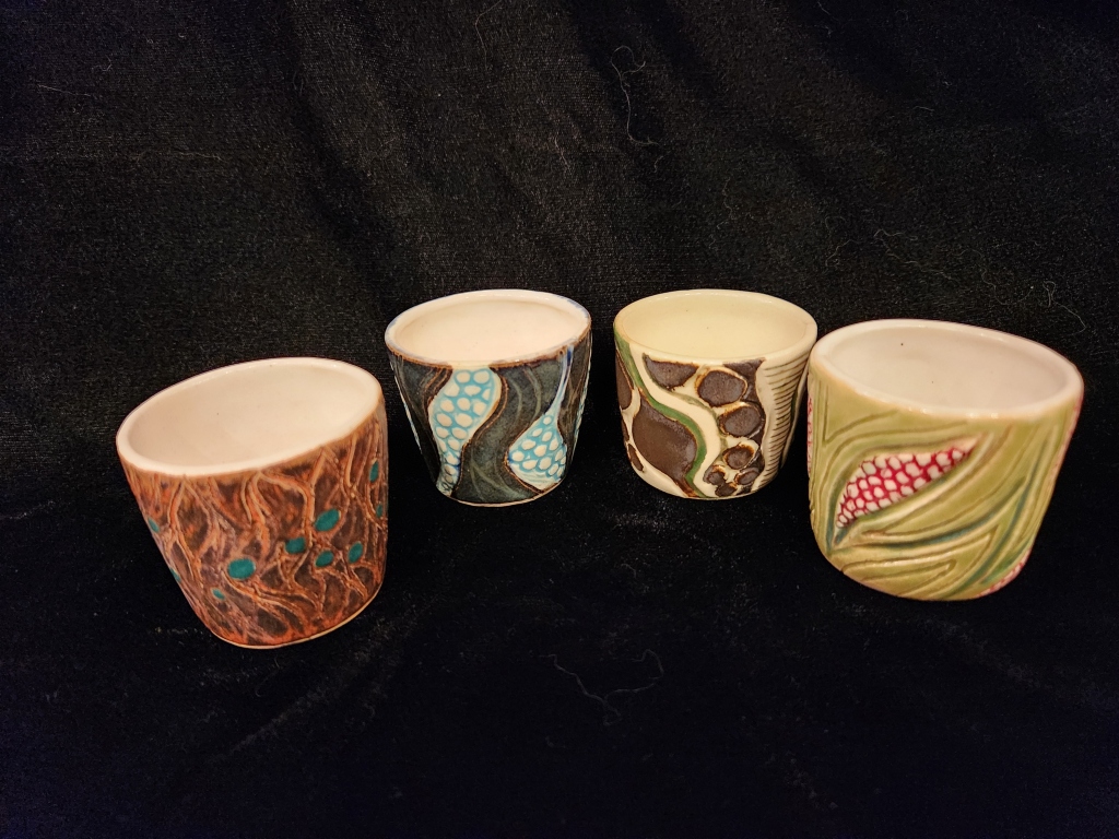
Whew! I finally finished my second project for the Dynamic and Asymmetrical Wheel course. I won’t show you the early exploratory pieces (which are now in the trash), but only the final finished pieces that make up the main body of the work. A lot of thought and experimentation went into this project.

I decided to use my lifelong love of rocks and geology as the inspiration for this work. Let me tell you about the time I blew out the shocks in the car ferrying home quite a number of rocks I had collected on the north coast of the Atlantic…well maybe not. But suffice it to say that I have a fascination with earthly constructions and its components. Perhaps that is what led me into ceramics. After all, what am I working with if not pulverized rocks?

What am I am attempting to do is to give the impression of stratified rocks (such as in the cutaway of cliff), solid rock (as in, for example, granite), and even pebbly rocks (think moraine at the bottom of a glacier). As much as possible, I am trying to invoke a feeling of movement. Water and/or sky may have sneaked in as well.

I said I was experimenting. My initial attempts involved trying to marry up a stoneware clay with porcelain, but it didn’t work because they dried at such different rates causing way too many alarming cracks. (Trash, but I learned something before going farther.) So then I used the same clay for both the bottom layers and the solid tops. I had never used this clay before, so it was going to be a surprise as to how it would react to the homemade and commercial glazes I used.

The common denominator for all of the pieces is the solidity and stability of solid rock–that is, the white overlay portions of each pot. When I first started using this clay, I thought it was a red clay. But after those first initial attempts, I realized that it was more of a dark buff stoneware that had a lot of manganese in it, as evidenced by the speckles that rose to the surface after firing. I wasn’t sure how white I could get it to be. So I put a few coats of white underglaze on those top “solid rock” sections before bisquing. In most cases. I also tried porcelain slip and on one, white glaze (by accident). I then covered those areas with several coats of white opaque glaze before firing to cone 6. I was pleasantly surprised! The result of the white underglaze under white glaze is a beautiful matte surface reminiscent of soapstone, only smoother. The porcelain slip under white glaze turned out glossy. The white glaze under white glaze is also glossy. My favorite, hands down, is the matte “soapstone.”

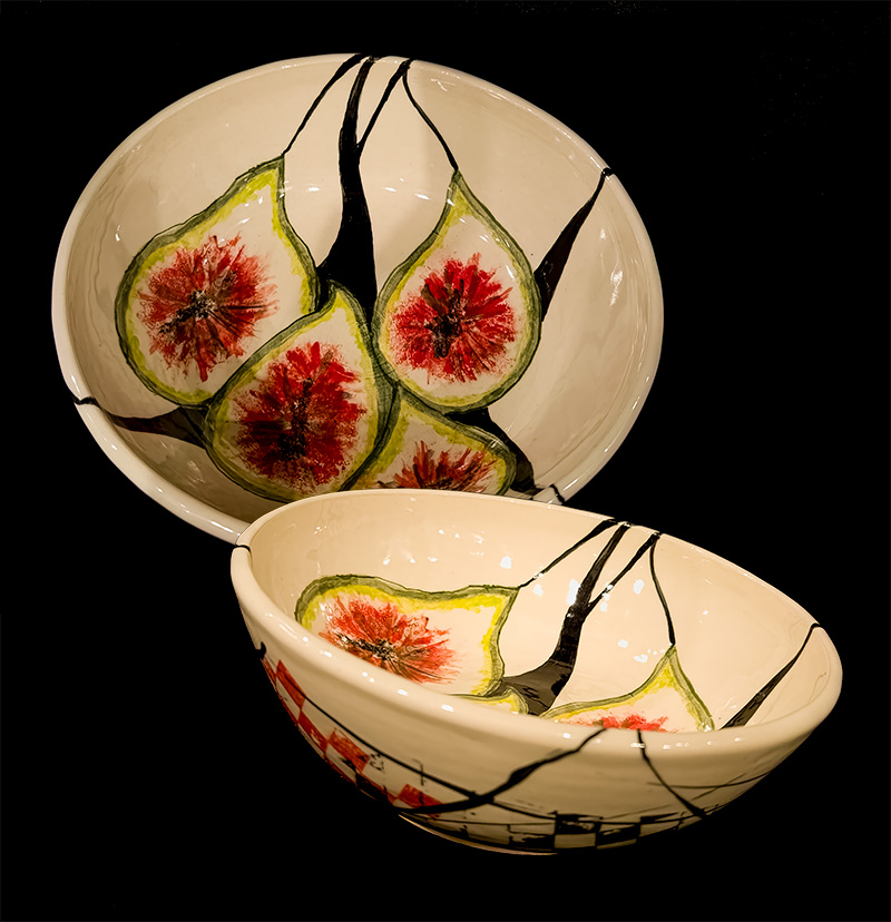
The bowls pictured at the top are not actually two bowls, but opposite sides of the same bowl. Here I am using blue and green, which could indicate sky, or water, or stylized rock formations, or all of these. I let the clay show through in the carved areas to add to the impression of rock. This bowl has the soapstone top and inside.

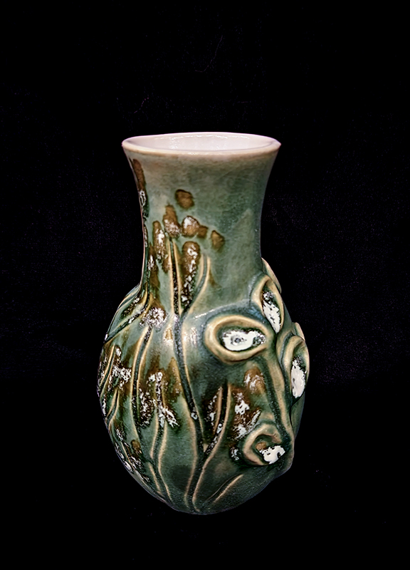
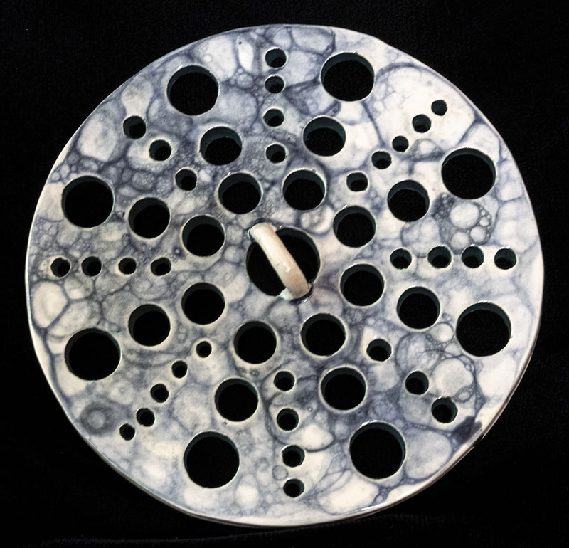
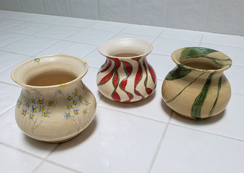
The very small abstract vase in the second group is the only piece that is not stoneware clay. It is porcelain. I was still at the experimental stage. I went wild by using 7 different glazes. This one survived and in fact has been snatched up by a friend.

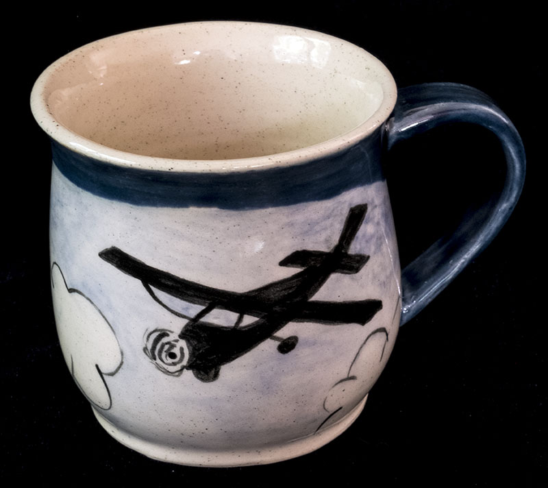
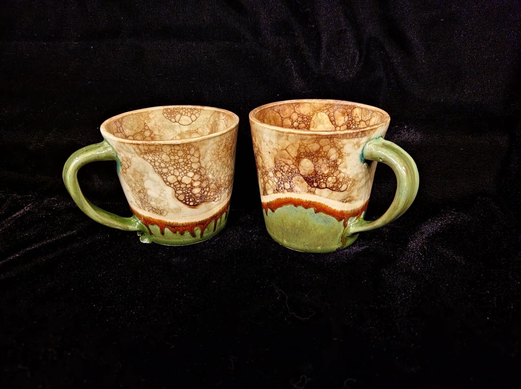
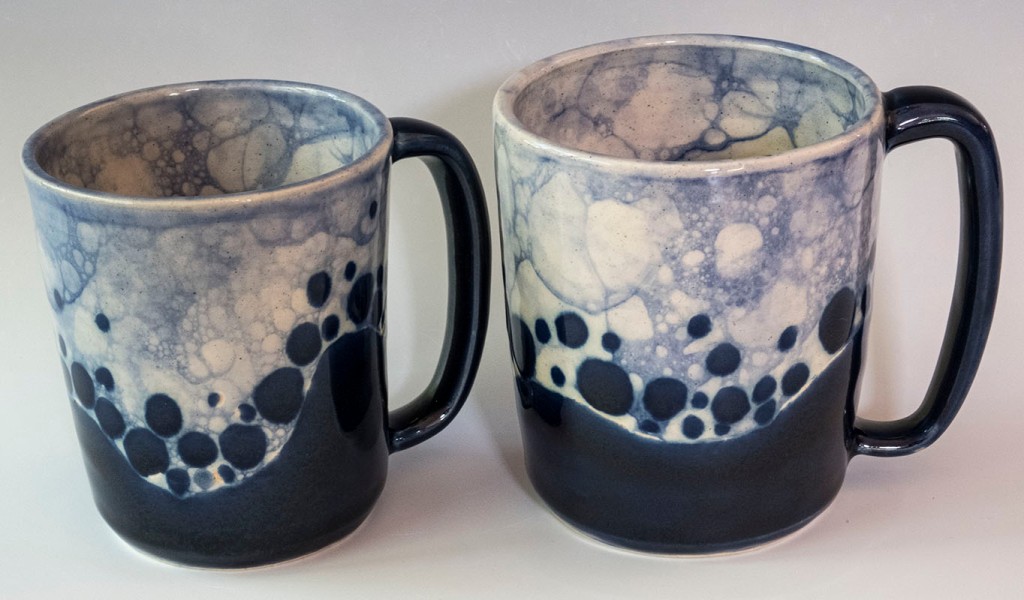
The two mugs have the soapstone tops and insides, but on these I let the different glazes I used overlap. Aside from the slightly VanGoghian look of the blues fuzzing into each other, I’m not a fan.

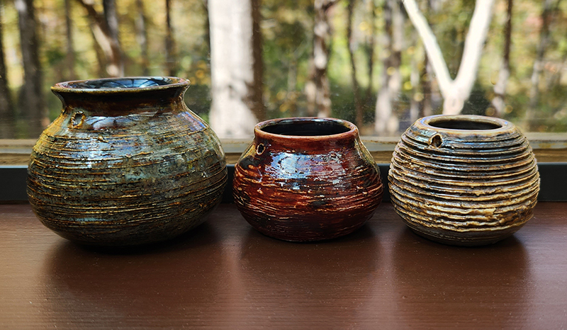
The next grouping shows three vases. This is actually one vase. I made two different lids for it. This also features the soapstone look, but with a twist. I was using my very runny faux metallic glaze near the top and I think my grubby fingers rubbed some into the white flowing down the body. The result is not unpleasant. It’s just slightly dark and more matte than other pieces with this underglaze/glaze combination. I carved the bottom portion of the vase to leave raised circles (rocks) and then applied a homemade magnesium crawl glaze over the dark brown glaze on those raised portions.

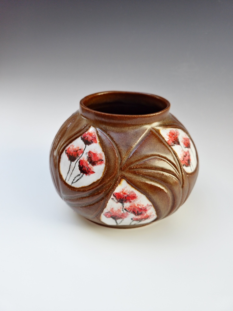
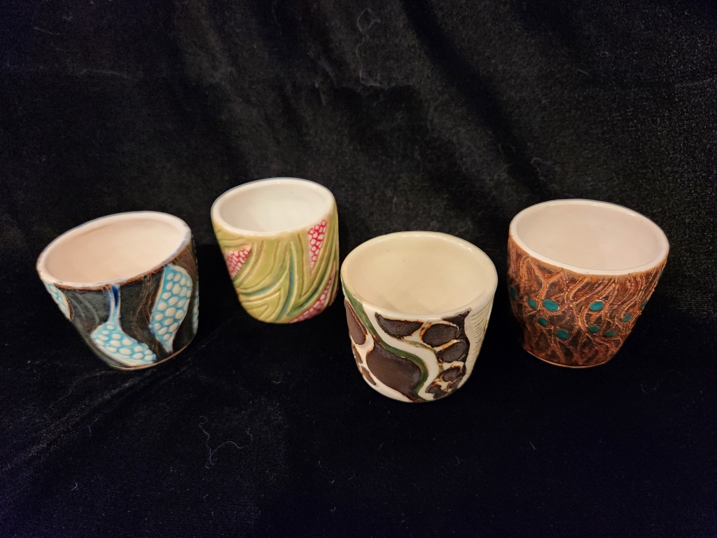
The next two vases again show the clay in the carved stratifications, but the white tops are slightly different. On the pink, black, and red vase, I used white slip on the bottommost white layer and white glaze on the topmost one. You can see the difference in the look and feel. In the vase on the right, the white portion is where I goofed and applied white glaze to the pre-bisque piece. It came out glossy with a blurring of the speckles.

The double flower pot shown last is a bit of a departure from the others, but here I was aiming for tumbled rocks with my zinc crawl glaze. The white top and inside is again the soapstone.

I’m having fun with these and am in the process of making more in this style. Experimenting again, of course!

Porcelain and Paper Clay

Remember way back on March 26 when I posted an update about what I was doing while not having access to a kiln? In fact, here, I’ll even give you the link: https://ceramiclectia.wordpress.com/2020/03/26/pottery-in-the-time-of-coronavirus/. Well, I finally finished a couple of those projects. The big bowl with the balls (kind of like this one) that I was repairing with paperclay bit the dust. The paperclay didn’t work on an already bisqued piece that was so large. It came back in even more pieces. Sad. Very sad. But I moved on.

The vase with the blue balls on the left is the only survivor (after I lost that big bowl) of the porcelain workshop I took last fall. It ended up being a crossover project as I affixed paperclay balls (paperclay was my research project for my Clay Materials class) to the outside as decoration. It worked pretty well. I also tried Amaco’s brush-on celadon glaze. The clear comes out very shiny and nice, but unfortunately it covered over the  blue celadon I had painted on under it on the balls. I had to reglaze the piece to get the blue back on. The nice thing about using paperclay for outside decoration is that it’s very light. If I had put clay balls on the outside of this vase, it would have ended up being very heavy.

The square something on the left is all paperclay. If you follow the link in paragraph 1, you’ll see how it started. I’m not sure I would use paperclay to make functional items again. It’s more for sculpture. But it was fun to try this. I had painted green celadon on top of the clear celadon, so there was no having to redo anything. Learning from my experimentation.

Cheating, Sort of

ThreeSmallVases_20200615_115042

These three small vases came about as part of Lab 1 in my Clay Materials class last fall. In this lab, we had to make ten different samples of clay from scratch (in my case, porcelain) and then make the same thing from each of the 1 lb. samples. The instructor likes to have his students fire to cone 10, so that’s what happened to these vases. No bisquing.

Well, I forgot. There were five of these that turned out pretty good, so I decided to finish them, which for me meant painting on some decoration with underglaze and underglaze pastels. I then sent them back for bisque. It was only after I got them back that I remembered that they had already been all the way to cone 10 and back!

What to do? The underglaze had baked on nicely. I thought, maybe the pots would accept clear glaze, too. I dithered back and forth several times. I didn’t want the rough surface. I painted on clear glaze, I washed it off; I painted on clear glaze again, I washed it off again. I really didn’t want any studio managers kicking me out of their studio after my vases had had slithered glaze all over their kiln shelves.

Finally, I had an idea. I applied two coats of shellac inside and out to each of the pots. After all, no one would be eating out of these. They are largely decorative. They could even hold water and plants if someone so desired. The shellac worked really well. It made the colors more saturated and put a nice sheen on the vases.

Success! I have two more that survived Lab 1. I think I’ll finish those, too.

Gas Kiln Firing in Reduction

So. Being a newly minted graduate student of ceramic arts this summer, I continued my studies into the fall with a class in kiln firing technology. Specifically, a soft-brick gas kiln fired in reduction. Unfortunately, this class occurred simultaneously to a semester-long class in glaze chemistry, so my expertise in cone 10 glazes, in reduction or otherwise, was still little to nothing. I was also not at all familiar with the glazes in the high-fire glaze kitchen.

My first reaction on seeing my pieces come out of the kiln, which had cooked away for more than 12 hours, was disappointment. At the time of glazing, I had completely missed the boat on how carbon monoxide that is formed when the kiln is starved of oxygen goes looking for the iron and copper molecules in the glazes–very specific glazes. I did notice that the more experienced players in our group were clustered around something called Pete’s Cranberry (not red), or something like that. Didn’t sound very red to me. I did, however, see at least one other bucket with “red” in the title. Being one to shy away from crowds, I headed for not only the less crowded buckets, but was also trying to be mindful about which glazes would be food safe as half of my pieces were meant to hold food or drink. And then there was the time factor. The glazing portion of the class was minor compared to theory and actual kiln firing. So, you’re right in guessing that it was a rush. I stuck with safe. And got back boring in return.

But once I got these pieces home, I started to make my peace with them. After all, they were at least well thrown pieces, and the glazes, while not the flashy reds I would have preferred, were mostly attractive, if understated.

A few notes about the pieces pictured above. The sculpture on the top right was a piece I made in a sculpture class over the summer. If you can imagine an under-arm twirl dancing move, that’s what it’s meant to represent. It was not supposed to survive as my sculpting technique when I made it was still subpar. The instructor clucked over it and I had put it aside as non-viable. Two other similar pieces I subsequently made using a coiling technique that was supposed to be strong never made it to the bisque stage without cracking or exploding. Fortunately, stubborn thing that I am, I went back and finished this piece. It has a few cracks in it, one of them showing daylight on the other side, but is otherwise sturdy and intact. Just shows you how unpredictable creating ceramics can be.

The plate on the top right is rather large (for my throwing skills). Because the glaze buckets were too small to accommodate it for dipping, I brushed on the glaze, as I did for many of the pieces here. After the fact, I found out that a gum substance that can be added to glazes to make them more brushable was not present in these glazes, hence the peeking through of the clay bodies in many spots. I found it most disconcerting on the large plate as it came out looking like something ancient unearthed at an archeological dig. The other problem I had with many of the white looking  pieces, which were various combinations of white, yellow, and blue salt glazes, was that these glazes were rather thick. One mug had an interesting surface design that got completely covered over, never to be seen again.

I glazed the two brownish pieces with a red shino. Hmmm…not very red.

The handless cup on the bottom left uses something called a celadon glaze, which is more transparent (I now know). I could have, should have used it on the mug with the surface design. Fortunately I didn’t use any of the heavyweight glazes on my funky hand-built vase (bottom center). I would have lost all of the detail. On that one, I used a red iron oxide wash my instructor helped me make. Sadly, I didn’t seal the bottom of the vase properly and all water poured in pours out just as fast. I will need to buy a plastic or glass insert for it.

My favorite piece by far is the little bowl on the bottom right. I made that bowl, not at the college using cone 10, high-fire clay, but at the studio where I usually work using cone 6, mid-fire clay. I had heard from salt-fire folks that this particular clay holds up well with interesting results when high-fired in salt reduction. So I made an experiment. To add to the experimentation, I plastered it with a test glaze I made (an assignment) that used the yellow salt glaze as the base and changed the colorant to red. Didn’t work as planned as the colorant I added went on vacation somewhere, but look at the bowl. Didn’t it come out well? It looks like a matte soapstone.

Despite the “interesting” results, I sure did enjoy the entire process. Now that I’m well educated, I definitely need to do another gas kiln reduction firing.